| Click on thumbnail to enlarge. | |||
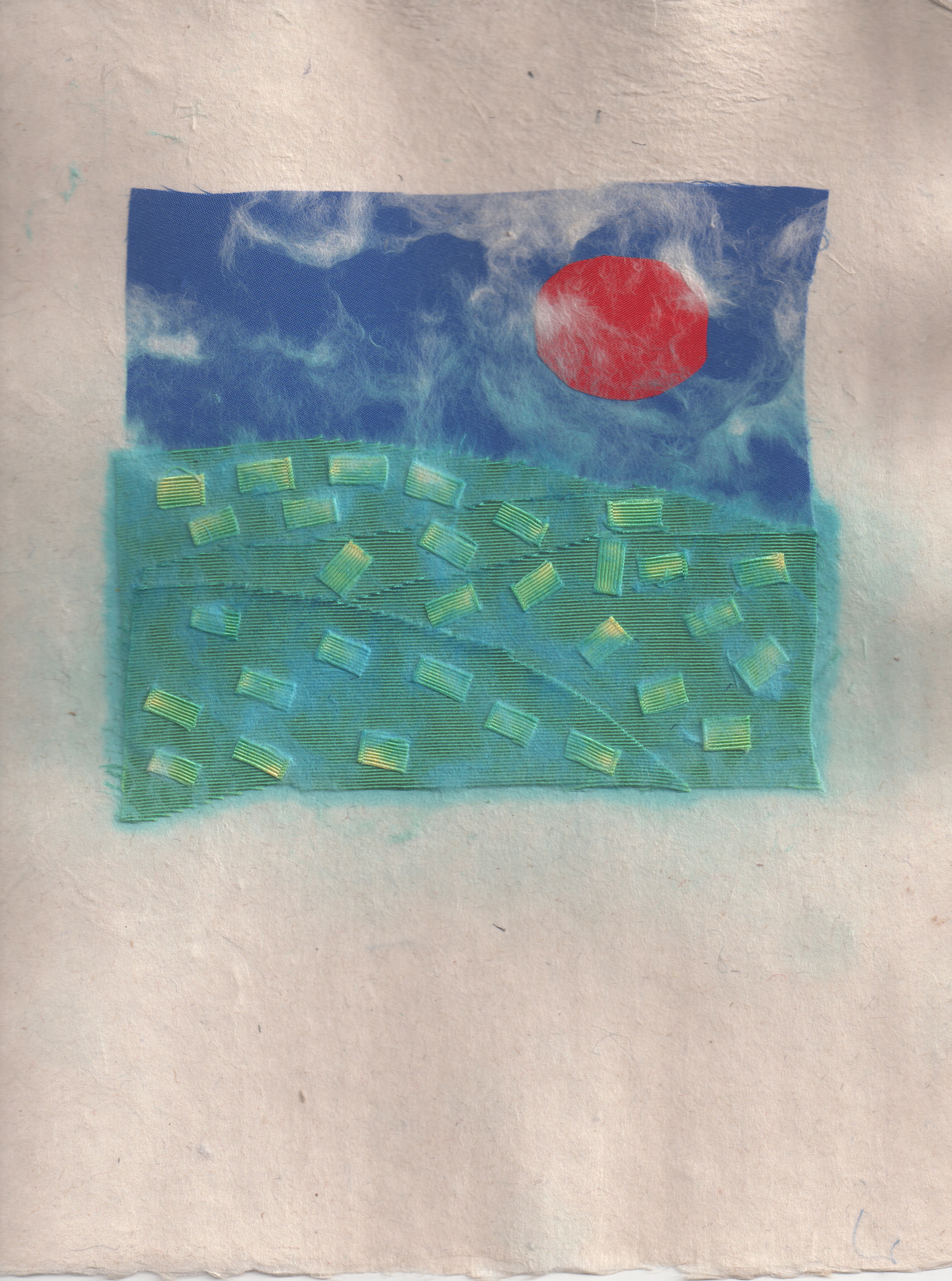 "Sunset & hay bales" (paper and fabric scraps, 1992). |
The image has bindings cropped out. The sheet is a cover for one copy of the 1992 issue. Formed from scraps I'd gathered, this construction was something I'd kept in mind from haying one week at a neighbor's farm. The green fabric bled all over the yellow. It was a fiery red sunset, casting the deepest and richest shades of colors. I like the clouds. | ||
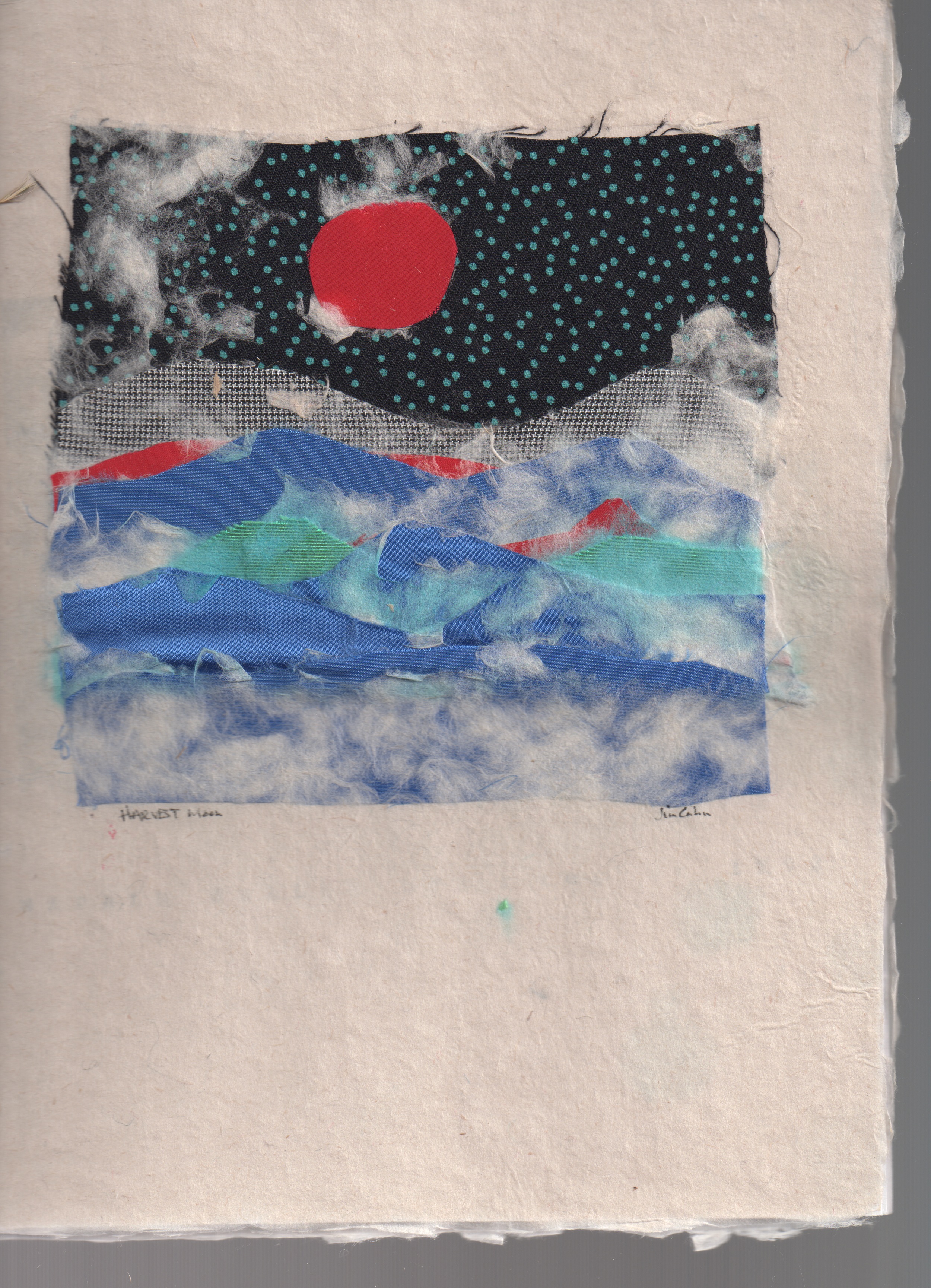 "Mountains, stars & moon" (paper and fabric scraps, 1992.) |
This sheet never made it to a cover of the 1992 issue of Napalm Health Spa. I guess I liked it too much. Although I was living near the Adirondacks, and spent a good deal of time camping there, it appears that I was thinking about Colorado and the mountains there. I would move back to Boulder that summer. | ||
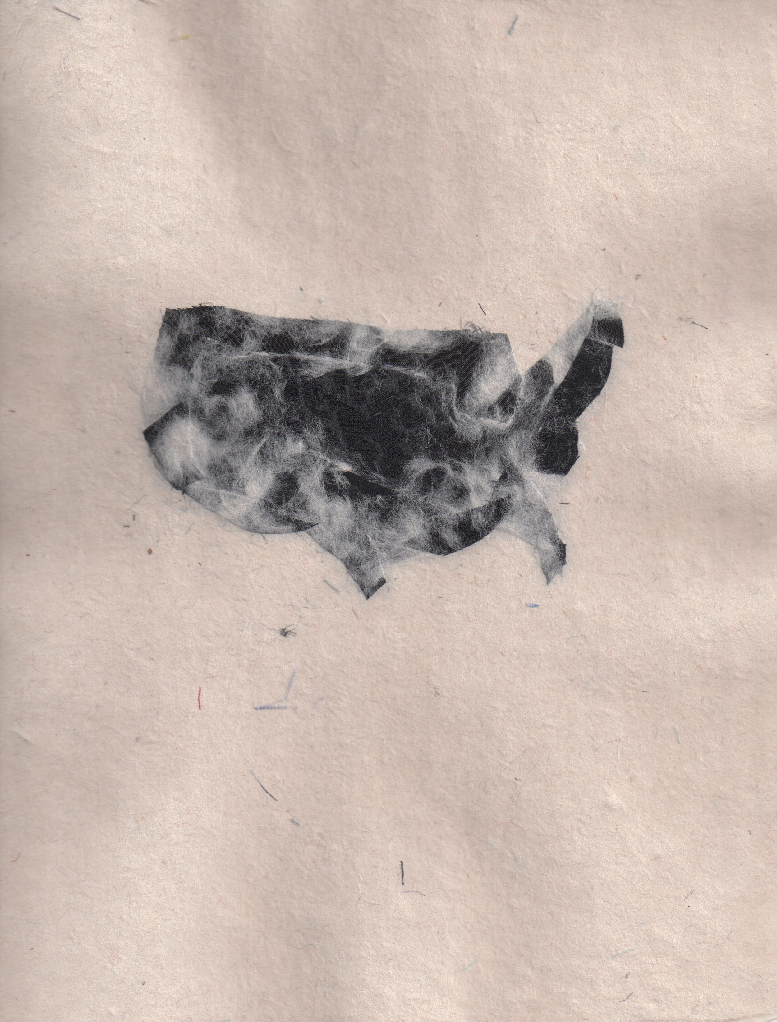
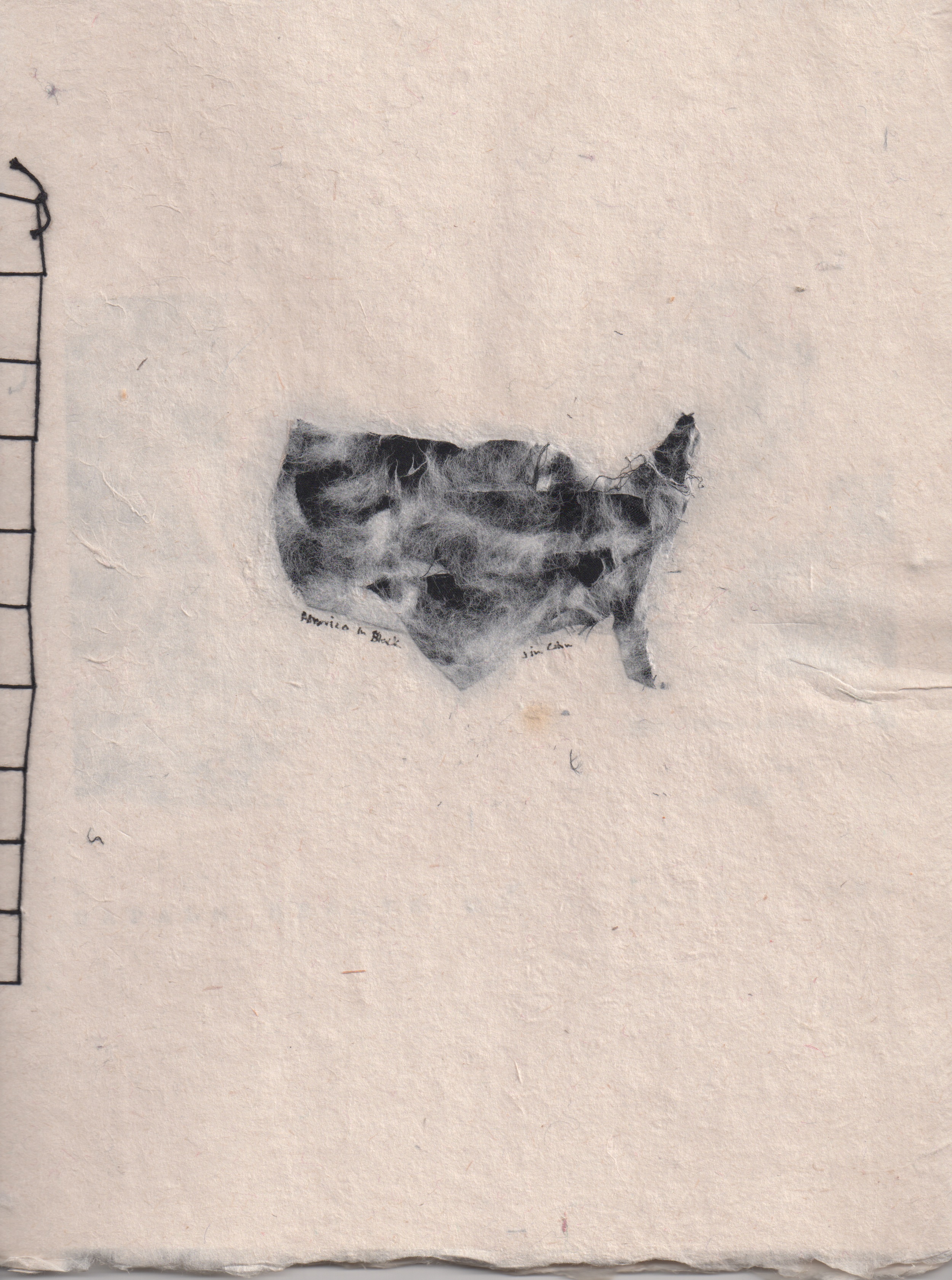 "Little USA in Black" (paper and black fabric scrap, 1992). |
I wasn't trying to make any kind of political statement at al with this piece. This was my first attempt using the outline of the continental USA on paper. You can see the hand stitched kite string binding and cover of a copy of Napalm Health Spa: Report 1992. | ||
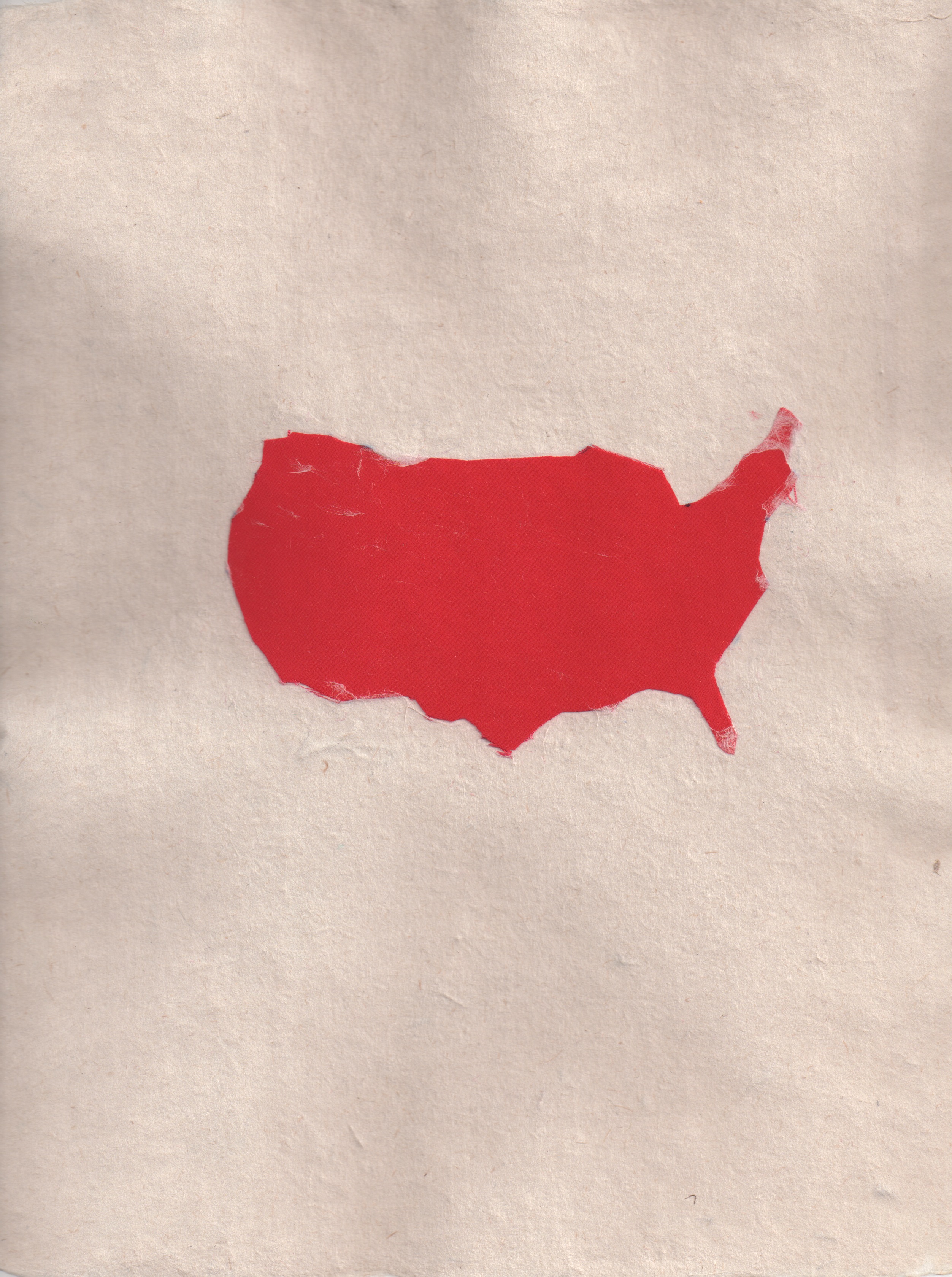 "USA in Red" (paper and red fabric scrap) |
There's some pretty detailed silhouetting in this, my second continental USA cut piece of fabric on paper. This remained an unstitched sheet. I just kept it. I was thinking of Native America when I did this one. | ||
 "Big USA in Black" (paper and black fabric scrap, 1992). |
A bigger version, less clouds. I was thinking of Black America, the enormity of so many, such greatness generations enslaved for the making of America. A sheet, not a cover. | ||
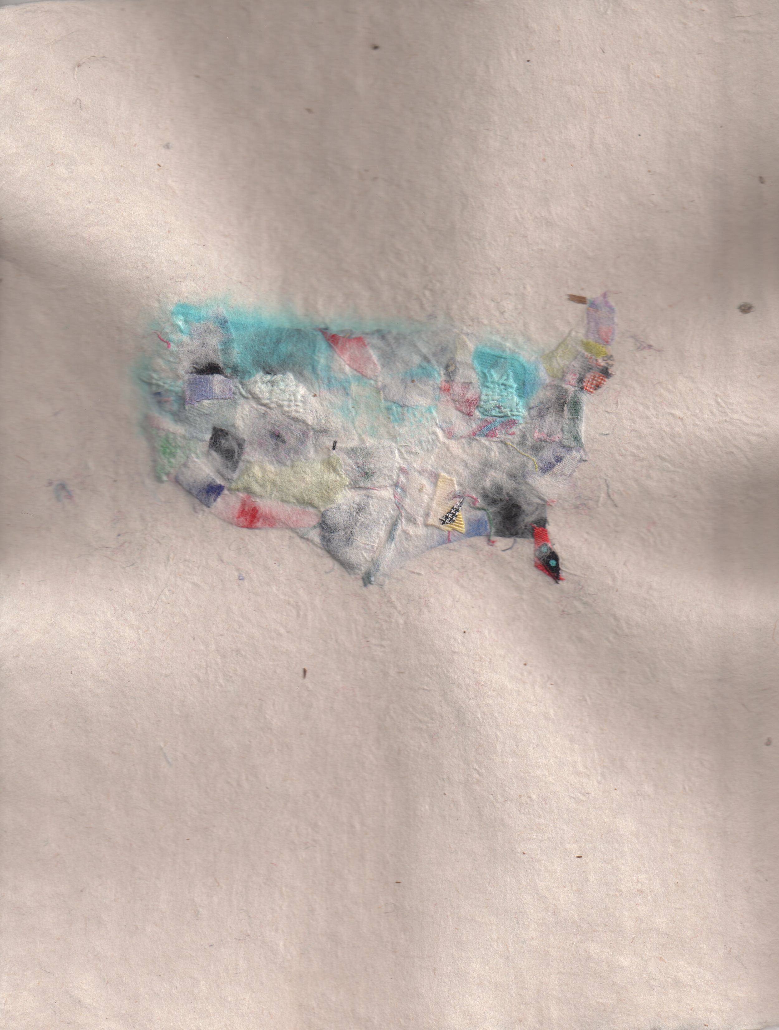 "Color USA" (paper and fabric scraps, 1992). |
This was the beginning of mapmaking for me. It wasn't just a frame anymore. I was conceptualizing content, as it is today. Not as it used to mean. I once wrote the painter Jasper Johns a letter I liked his work so much. | ||
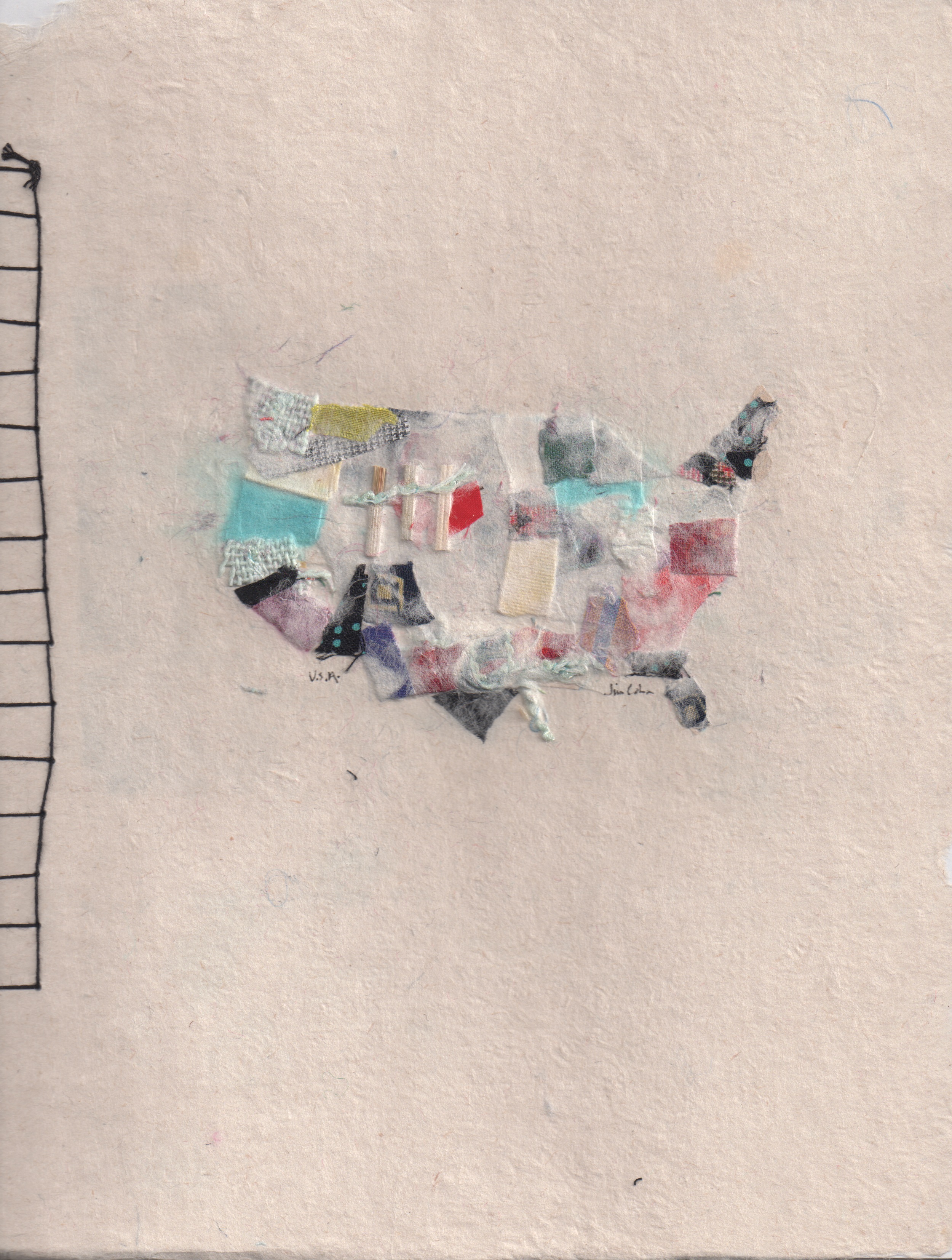 "Many Colors USA" (paper and fabric scraps, 1992). |
This piece is a copy cover that never went out. Really, it was the gateway to the visual architecture that went into the Museum of American Poetics website. I needed that kind of texture to be an element of the content. I never understood why I liked Jasper Johns, but what I was feeling he'd more or less executed back when he did Map (1961). | ||
© 1998 - 2011 Jim Cohn. All rights reserved.